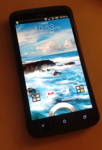
 I first picked my HTC One X a few months ago, the absolute moment I could upgrade my previous 18 month contract I had on my HTC Desire HD. I’m sure the Desire had some life left in it, except that I’d cracked the screen. Badly. While I was tempted to write a glowing report a week in, I put it off… I wanted to put it to the test, see if it still impressed me a couple months in.
TL;DR Still thoroughly impressed, thrilled even, with the device. For a well rounded review, I’m reporting here on both the good and the bad.
Now, I’ve been an HTC + Android fan since the early days. I picked up the HTC Hero (the one with the chin) back in the summer of 2009. So when they announced the One X, and its near-perfect timing in line with the end of my contract, I was sold.
My Desire HD was stuck on Froyo for the foreseeable future, and it was slowing down. Worse, the battery, which had never been very good, was giving me no love at all.
Battery life
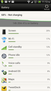
More than anything, this is where I’m been the most impressed. Seriously, I can’t kill this thing. My phone flicks on and off all day, as I check the latest email, Tweet, whatever. Light browsing, plenty of Maps usage, occasionally games, Spotify daily. I keep my screen on the brightest setting, I run just about every widget from my ‘desktop’, yet I routinely get 20-25 hours battery life. Yes, for some stretches of that, the phone’s doing nothing (I do sleep), but I find myself 2 days in, wondering whether I need to charge the phone. Check, it’s on green. We’re good to go. As I write this, my phone is 68% charged and it’s been going 14 hours.
On heavy days, like while reporting on a ProductTank event, I get less out of it, but we’re still talking nearer to 14-16 hours. Besides the rare occasion where I decide to ignore my phone’s 10% battery warning and still go out for a day, I’ve never run it down.
Impressed.
Speed
Ohhh, this thing is nice.
The 1.5GHz quad-core processor in the One X makes all the difference in the world. It’s allowed me to completely rewrite my mobile habits, compared to its restrictively slow predecessors (I’m hugely impatient, and find my new iPad annoyingly slow at times). I used to avoid cracking open files or pulling up a map in my previous phones. On the One X? I don’t hesitate to crack open intensive apps, knowing it’ll handle anything I throw at it. Very rarely does it leave me hanging.
Enough said, no qualms.
Design
 The screen, oh my, what a screen. A glorious 4.7 inch panel of pure brilliance. Sometimes I just turn it on to look at the bright, crisp colours.
However, it means the damn thing is just a bit too big. I could just barely wrap my hands around the HTC Desire HD, but with the One X, I’m left a little handicapped with one handed mobile usage.
The ‘ON’ button is a low profile button at the top right of the phone, while the ‘pin’ to drag and unlock the phone is right near the bottom of the screen. I can’t unlock my phone with one hand holding it in the air.
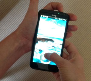 Also annoying is the location of the button. It’s on the top of the phone, but on a bevel that faces ever so slightly forward. This makes it tricky to push it down when manoeuvring from behind… exactly the position you’re in if you’re holding the phone with one hand.
In order to get a good grip to get the button pushed in, I squeeze the sides. Here’s another problem: the volume button is on one side, and the micro USB slot is on the other. If the phone is plugged in, the cord further hampers my ability to turn on the phone with one hand. If it’s not, I end up squishing the volume rocker in, accidentally changing the volume settings when I wanted to do is close the phone for a moment.
Purely on the design side of things, it’s a lovely looking phone. Clean lines, matte charcoal colour. More than anything, the design just lets the screen dominate, rightfully so, and otherwise is simple and understated. I like this.
This leads to, perhaps more so than the button placement, my biggest qualm with the phone.
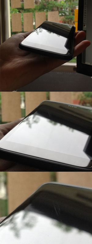
Scratches practically imperceptible... but they're there!
Now, don’t get me wrong, these are whispers of scratches, completely imperceptible unless you’re squinting up close or catching the sun on a blackened screen. But they are still there.
I understand the push back I get when I mention this point: “You shoulda had a screen protector”. Hrmph. To be honest, I hate screen protectors and the grimy filth they all accumulate at their sticky edges. I hate the plasticky feel under my fingers. The One X is bestowed with a screen that feels like satin. Splendid to touch, I can’t stress this enough.
But as I mentioned, I had two of HTCs predecessors. I treated the Hero and the Desire HD like crap. We’re talking throw-it-in-the-bottom-of-the-purse-with-the-metal-nail-file kind of crap. In an accumulated nearly 3 years between those two devices, never a scratch on the screen (besides the blunt drop which finished the Desire completely).
So my expectations for the One X were way up there, and I immediately started tossing it around as I did my old phones. Within a couple weeks? A series of scratches leading up with a swish from the centre of the screen to the top right corner. I think from having it face down on a lightly grainy surface. Officially annoyed with this.
Same with the camera lens on the back, which juts out just a smidgen. Again, quite imperceptibly so, the lens is getting the same scratches. Can’t see it in the photos, and like the faint marks on the front of the screen, it’s never caused a problem at all. But they are there.
Why would HTC suddenly downgrade an aspect of their phones that they had clearly nailed? No idea, but the Gorilla glass is a bit of a let-down.
I miss the dedicated search button and menu button from both the HTC Desire HD and the HTC Hero, and even to this day, miss the rolly ball that the Hero offered. Apps have mostly negated a real need for them, but they were consistent and useful. I’m not entirely impressed with this slow progression towards a one-button device.
Operating system and apps
The operating system upgrade, from my previous 2.3, is massive. The Android Ice Cream (4.1) offers a much more cohesive experience, and a lovely blend of the vanilla Android interface elements with the HTC Sense overlay.
While I miss my dedicated Menu button, the latest OS seems geared to make up for it. As with any Android, I can customise the home screens to my heart’s content, and in particular, love the permanent apps I can keep on my lock screen, jumping straight to them when I open my phone.
 I got my iPad for handling emails on the go, more than anything, but even at a fraction of the screen size, the HTC One X suits me and my 8 Google Apps inboxes infinitely better. For the occasional light user of the default @me.com account and maybe one other, an Apple will do the trick, but if you’re like me and are used to the power and flexibility of GMail, I’ve yet to see anything other than an Android suffice. The latest update has sweetened the deal even further, especially when combined with the massive screen.
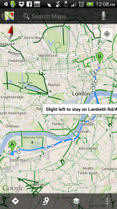
As of course, being a Google kit, the maps work a treat. If you’re living somewhere like London where knowing your best transit vs. cycle vs. walking route will be taking you is essential, and so the Google Maps is a deal maker.
Conclusion
With the honeymoon period over, I’m still loving this phone. Sure, the iPhone 5 was on the horizon when I made my decision, and the latest Windows phones are looking pretty nifty, but based on the heavy (and yes, geeky) usage I expect from my device, I’m pleased I’ve gone with the HTC One X.
Just don’t talk to me about the (ever so slightly newer, shinier, and more pumped) One X+.

There Are 4 Comments